
Wedding color palettes for 2026 are all about intention, warmth, and elevated simplicity. Couples are moving away from overly themed or trend-heavy palettes and instead choosing colors that feel timeless, photograph beautifully, and enhance the overall guest experience. Rather than asking “what’s popular,” many are asking “what feels like us?”—and that shift is shaping wedding color palettes for 2026.
Below are five seasonal wedding color palettes for 2026 we expect to see defining weddings this year, along with guidance on how to bring each one to life in a thoughtful, cohesive way.
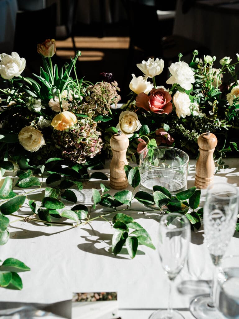
1. Spring: Soft Botanical Neutrals
These tones mirror what’s naturally happening outdoors in spring, which helps the design feel effortless and seasonally appropriate. Spring palettes are leaning organic and understated. Warm ivory, sage green, soft clay, and muted blush create a look that feels fresh without being overly pastel or sweet. These tones work especially well for garden venues, historic estates, and tented celebrations.
To elevate this palette, focus on texture rather than contrast. Think natural linens, stone or ceramic tableware, soft taper candles, and floral designs that feel loose and seasonal rather than overly structured. This approach allows the palette to feel romantic, refined, and effortless.
2. Summer: Sun-Washed Coastal Tones
Sun-washed hues photograph beautifully in natural light and feel relaxed without appearing unfinished. Summer 2026 is embracing warmth with restraint. Cream, sand, pale blue, and soft terracotta create a relaxed yet polished palette that feels perfect for waterfront venues, vineyards, or outdoor celebrations.
What makes this palette shine is layering. Pair light-colored linens with subtle pattern, incorporate woven or wood accents, and let florals stay tonal rather than bold. This keeps the look elevated and prevents it from feeling overly beach-themed or casual.
3. Early Fall: Earthy Romance
This palette bridges summer warmth and fall depth, making it ideal for transitional-season weddings. Early fall continues to favor warm, romantic tones like rust, olive, warm taupe, and dusty rose. This palette feels grounded and inviting while still offering depth and interest.
These colors pair beautifully with candlelight, natural wood elements, and soft metallics such as brushed brass or antique gold. Couples drawn to this palette often want a cozy, intimate feel without leaning into traditional fall clichés—and this combination delivers exactly that.
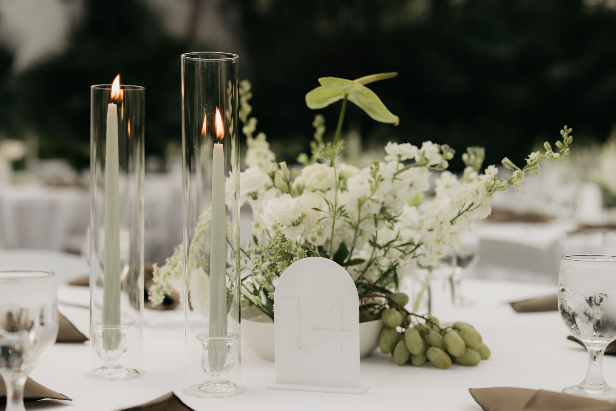
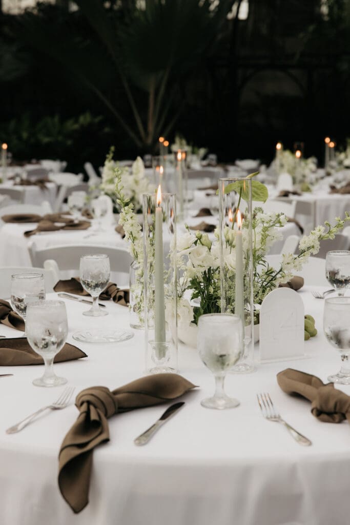
4. Late Fall: Moody Neutrals
For later fall weddings, deeper neutrals are taking center stage. They create intimacy and drama, especially for evening celebrations. Chocolate brown, charcoal, warm ivory, and muted plum create a rich, dramatic foundation that still feels timeless.
This palette benefits from intentional lighting and texture. Velvet linens, layered candles, and thoughtful floral placement help soften the darker tones and create a warm, inviting atmosphere. It’s an excellent choice for indoor venues, historic spaces, or evening celebrations.
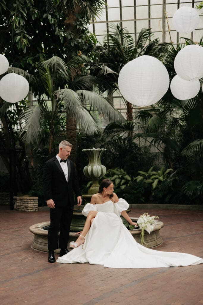
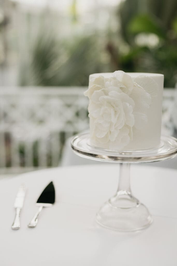
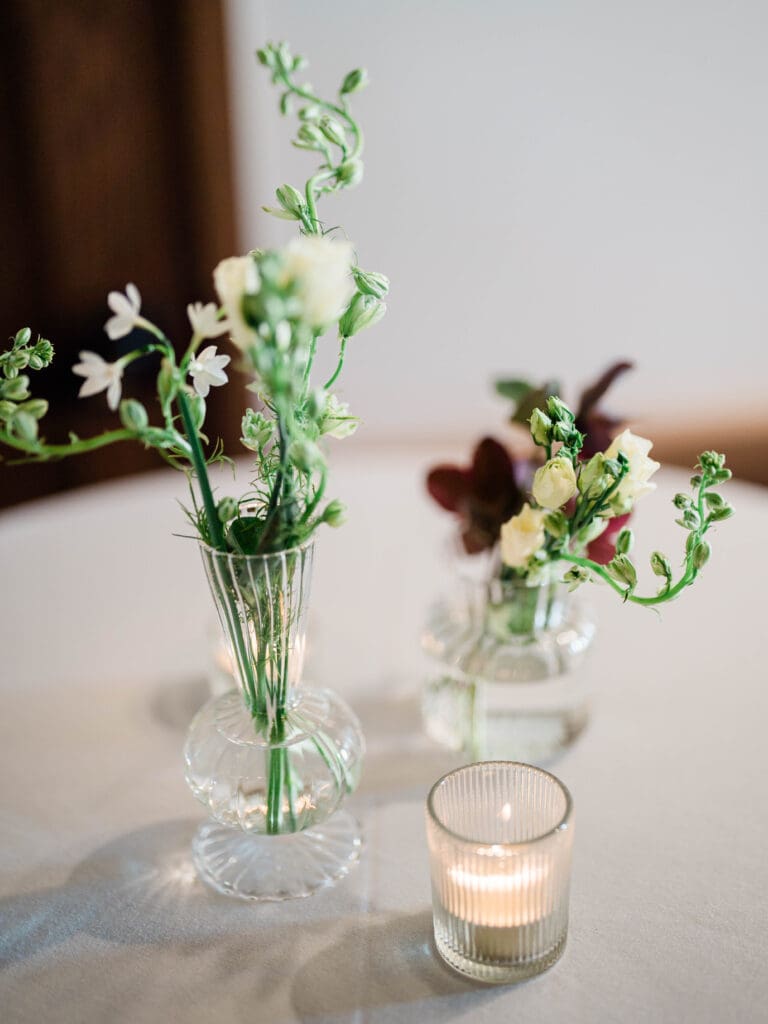
5. Winter: Elevated Minimalism
Minimal palettes allow intentional details—lighting, texture, and form—to take center stage. Winter palettes in 2026 are clean, modern, and quietly luxurious. Soft white, champagne, stone gray, and subtle metallic accents create a refined look that allows design details to shine.
Rather than relying on bold color, this palette comes to life through materials and lighting—think soft draping, reflective surfaces, and warm candlelight. It’s ideal for city weddings, ballrooms, or couples drawn to a minimalist aesthetic.
When choosing your wedding color palette, remember that the most successful designs are cohesive and intentional. One helpful exercise is identifying a primary color, a supporting neutral, and one accent tone. This prevents palettes from becoming overly complex and makes design decisions—like linens, stationery, and floral varieties—much clearer as planning progresses.
Rather than chasing trends, couples who focus on balance and restraint often end up with designs that feel timeless and deeply personal. Instead of selecting colors in isolation, think about how your palette will show up across stationery, linens, florals, attire, and lighting.
As wedding color palettes for 2026 continue to favor thoughtful restraint and layered neutrals, the most impactful designs will be those that feel aligned with both the season and the couple’s story. A well-chosen palette should enhance your venue, reflect your personal style, and support the overall experience you want to create for your guests.
When done thoughtfully, color becomes the quiet foundation that ties every detail together—without ever feeling forced or overly styled.
From full-service planning to wedding management, our team supports couples through every step of the process.